In the look to bring something new to your brand image?
My design toolkit orbits around 3D, animation, brand identity and front-end web development.
I'm always excited to hear about brand image goals, website ideas and prospective campaigns. Please don't be shy reach out to me through my email below.


Lana Wilkinson
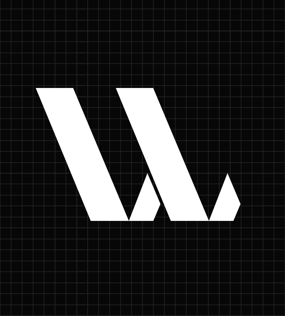
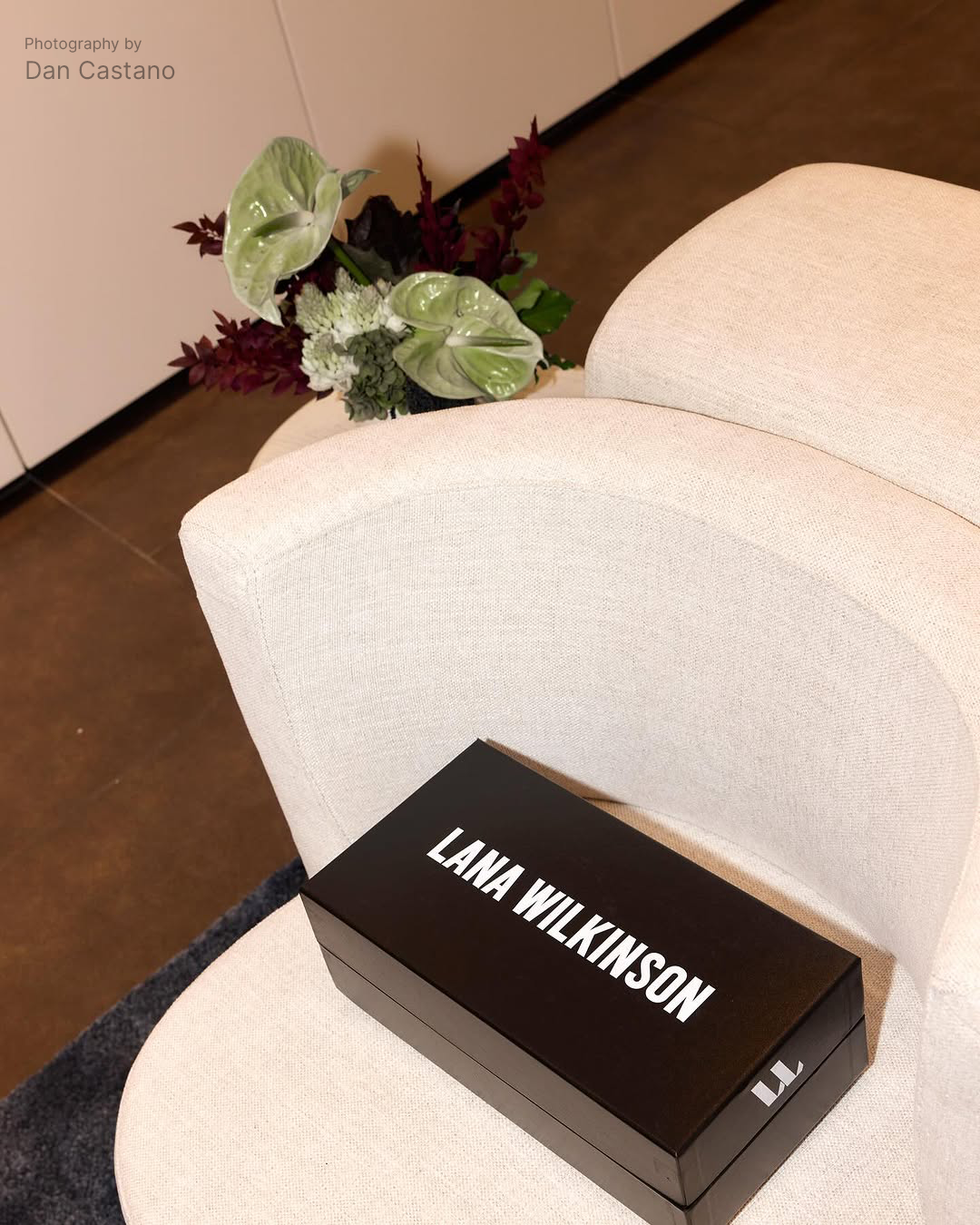
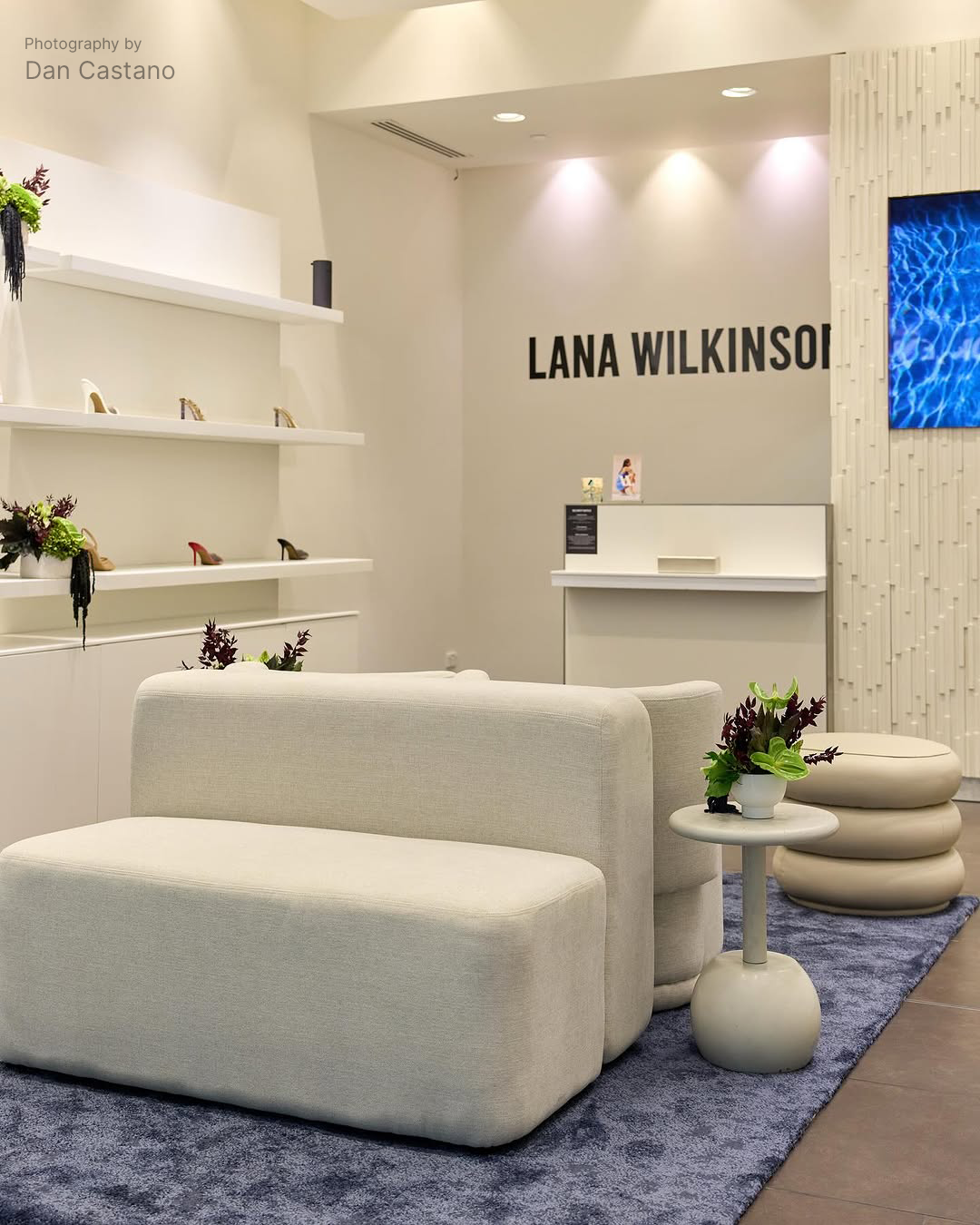
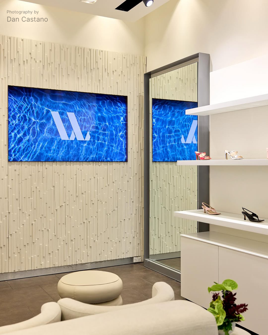
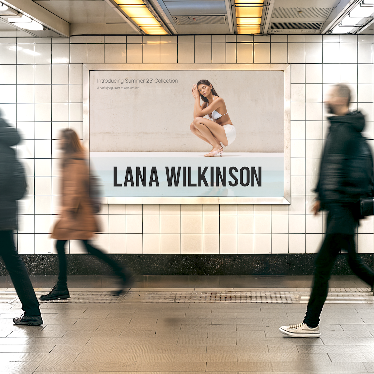
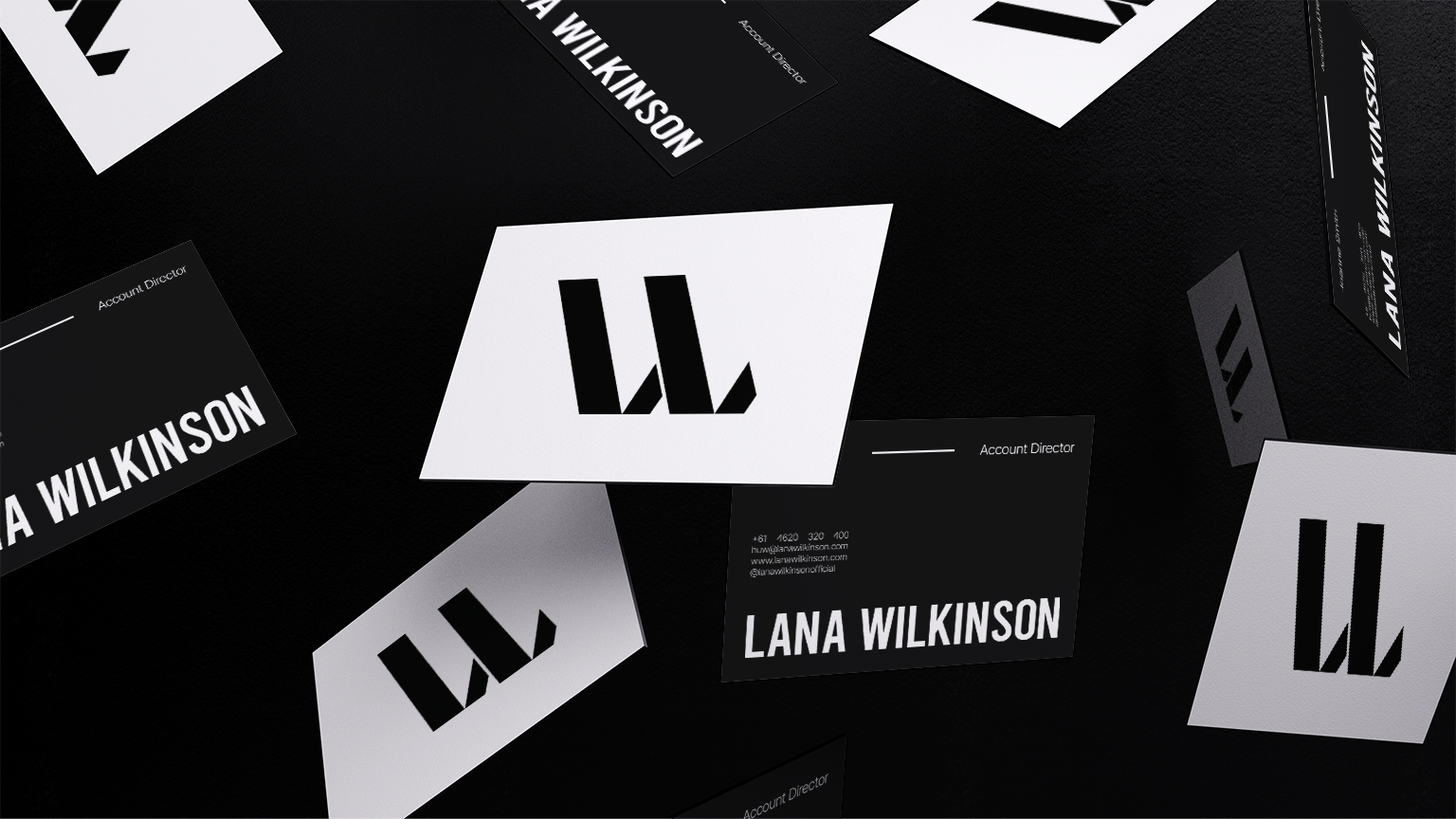
With a focus on occasion wear dressing, elevated styles and bold statements, Lana Wilkinson was looking for a new brand identity. Elegance is present with the logo mark through a dynamic form, it can be perceived as an 'L' for Lana, 'W' for Wilkinson, or it can even be a pair of heels. Since the shape is bold, it is typically placed as a 'signature' seperate to the logotype.
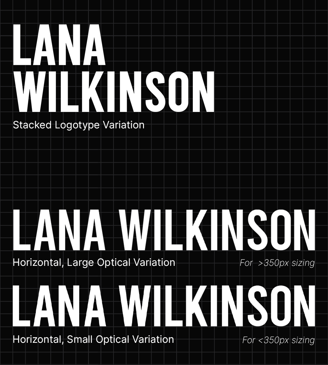
A uniform character height, x-scale and width is what makes the logotype fitting to communicate a statement brand like Lana Wilkinson. One aim of the rebrand was to have an adaptable logotype that can be bold large-scale but also small-scale, my solution was to provide two seperate optical weights with minor adjustments to each character's stroke contrast and x-heights.